Cisco Analytic Report
Report Scheduling Workflow + Pre-built Report Templates
Aim to visualize the historical data to provide insight about capacity planning and network operation
Role: I am the only designer who works on the report feature through the entire thing, from:
- Conduct a generative study with a researcher, and competitive research with PM
- Work closely with PMs to define report strategies
- Help team test multiple POCs by low-fidelity mockup
- Execute on IA, interaction, visual design for report framework and workflow
- Design and visualize 8 pre-built report templates
- Work with engineers to polish the design with the data in real-world
Contribution: Report is a high priority projects for a customer segment worth $1 billion in revenue for the company. After the project was launched, it accelerated software appliance adoption and achieved 30% license renewals.
Start from Generative Study
I work with a UX researcher and PM to make a study plan. Our research goal is to understand the current processes, needs, priorities and pain point involved in enterprise network teams generating reports. (10 users from 8 companies are interviewed remotely.)
Understand Users
Understand Report Context
Dashboard vs Report
To get a clear understanding of reports, I summarized the difference between dashboard and report.
-Comparing with daily troubleshooting on the dashboard, reports are widely used in long-term capacity planning. ( Eg. A network manager will estimate new devices purchase based on the device usage report in last year.) Report are used to identify what has happened, what is happening, and what will happen next.
-Data retention is how long information can be kept in the system for an organization. Data granularity refers to the data’s level of details.
In a report, we translate large data sets into charts, graphs, and table. The goal is using a visual representation of data:
– To see patterns, identify real-time trends, outliers, and insight.
– Understand the data quickly and make better decisions
3 Types of reports user needs
The contexts of reports and needs of the network enterprise user are very different from those for consumer-facing applications. Those requirements are diversity because of the different size of devices network team are managed, tools they are used, and purpose for reporting. But the needs could be classify by 3 kinds of duration.
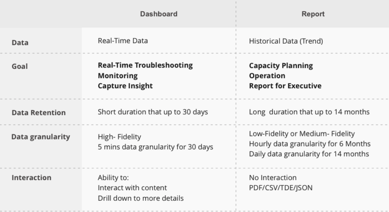
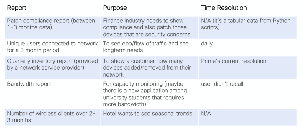
Most short duration reports are operational (e.g., for troubleshooting or status checks
Before Design: Competitive Audit and POCs
Competitive Audit
I did a competitive analysis with PM to discover reports feature in the network industry.
After analyzing 4 competitors, I got strategic insights into the functions, flows, and solutions.
Armed with that insight, I am able to set a clear goal for function, provide multiple design solutions, and evaluate the strategies based on resource investment.
Test Multiple POCs
Customized report with visualization tool is a big investment for the company. We cannot blindly create it without evaluating from users and business side. Therefore, I explored three potential designs based on founds before making a plan for report feature. The custom flexibility for the three hypotheses is from high to low.
Hypothesis 1: Custom Report Function
Hypothesis 1 allows users to customize objects into individual KPI level. And new KPIs created by user could be applied on both report and dashboard customization.
Ability to customize: ✯✯✯
Users are easy to pick up: ✩✩✩
Less Investment : ✩✩✩
Reasons for non-selection:
- Some customized charts are inaccurate and meaningless ( Eg. KPI: x-value and y-value didn’t match )
- Hard for users who has very little experience in data visualization
- A large financial investment with some technological constraints.
“This looks flexible and professional but works complicated.”
Hypothesis 2: Custom report by predefined KPI library
Hypothesis 2 provides a predefined attribute value for X / Y . Users can select chart type , like “Show me” function on Tableau.
Ability to customize: ✯✯✩
Users are easy to pick up: ✯✯✩
Less Investment: ✯✩✩
Reasons for non-selection:
- Hard to export raw data
- Hard for users who has very little experience on data visualization
- A large investment for building a predefined KPI library
Hypothesis 3: No customize function, predefined report templates
Hypothesis 3 has minimal customization but simplifies the report processes. First, we worked with network experts to select the valuable report topics, and then, designed the templates with best practice in data visualization. Users could schedule predefined reports directly.
Ability to customize: ✯✩✩
Users are easy to pick up: ✯✯✯
Less Investment: ✯✯✩
Reasons for selecting hypothesis 3 as a final plan
Based on findings from generative study, user’s expectation could be classified into two groups below.
Hypothesis 3 is the method that best meets both user’s expectations. It provides an intuitive and simple way even for non-expert users, and support raw data export for brownfield as well.
Framework Design
Report Generation Workflow
Design Goal:
- Keep the generation workflow simple and minimal
- Allow user search/view pre-build templates easily
- Allow user view all generated reports in one place
- Keep consistent experience for users to schedule/ edit/ receive reports
- Allow user to email / share(RBAC) / download report easily
“Simplify the Structure by reorganizing and classifying the content”
Design Deliverables for workflow
Templates Design
Pre-built Network Report Templates
Design Goal:
- Help users to communicate the data clearly and quickly
- Help users to process the data through the recognition of patterns, extreme value, and so on
- By leverage the strengths of data visualization to facilitate complex analysis and critical decision making
- Provide more report templates that gather valuable data for end-users
Step1 – Understand data and Simplify
My first round of design focused on the data itself. I asked my questions the following questions:
What data we have
What information do audiences’ expecting
What’s the burning questions that user want to get an answer from the report
How to make users understand it with minimum effort
Is there any data unnecessary and misleading
How to empower users to make a better-informed decision
Based on this step, I could have an understanding of the potential ways to visualize data.
Step2 – Translating large data sets and metrics into charts and graphics
Step 2.1 – Choose the right charts
Step 2.2 – Use color appropriately
Reference: https://guides.lib.berkeley.edu/data-visualization/design
Step3 – Scalability and Edge case
Unlike the dashboard, which conveys real-time information with an interactive functions such as sort, filter, drill into different data, the report presents a static graphical representation with complex data points. Therefore, considering design about scale and edge case becomes indispensable.
Design Deliverables
1
Report Generation Workflow
17
Report Templates
8
7
12
8
PDF Templates ( Visualized data by charts)
CSV Templates (Support export to 3rd party tool)
JSON Templates
TDE Templates
Collaboration + Learning after launch
Working in a Multidisciplinary Team
Review design with feature team early and often
The reports template has a dependency on what data we could provide from the system. Therefore, reviewing the design at different phases with different fidelity levels in the feature team is essential. By reviewing design early and often, the engineering team could have time to check whether the data in real-world is achievable or not, and we could make a clear plan in practice.
Exciting findings about data security
During the generative study, I was impressed by users’ requirements about data security. For instance, General Data Protection Regulation (GDRP) impacts how EU companies store their data for reporting. It also affects many participants from different companies who were not comfortable going to cloud storage to support long-term reporting.
Thanks for looking! Interesting More……


